Here’s an article that helps you understand how to use charts and graphs in your presentation.
What is the use of charts in PowerPoint?
A chart is a tool you can use to communicate your data graphically. Displaying charts in PowerPoint allows your audience to see the meaning behind the numbers, and it shows comparisons and trends much easier.
The following are the steps to use charts and graphs in your presentation, and they are as follows:
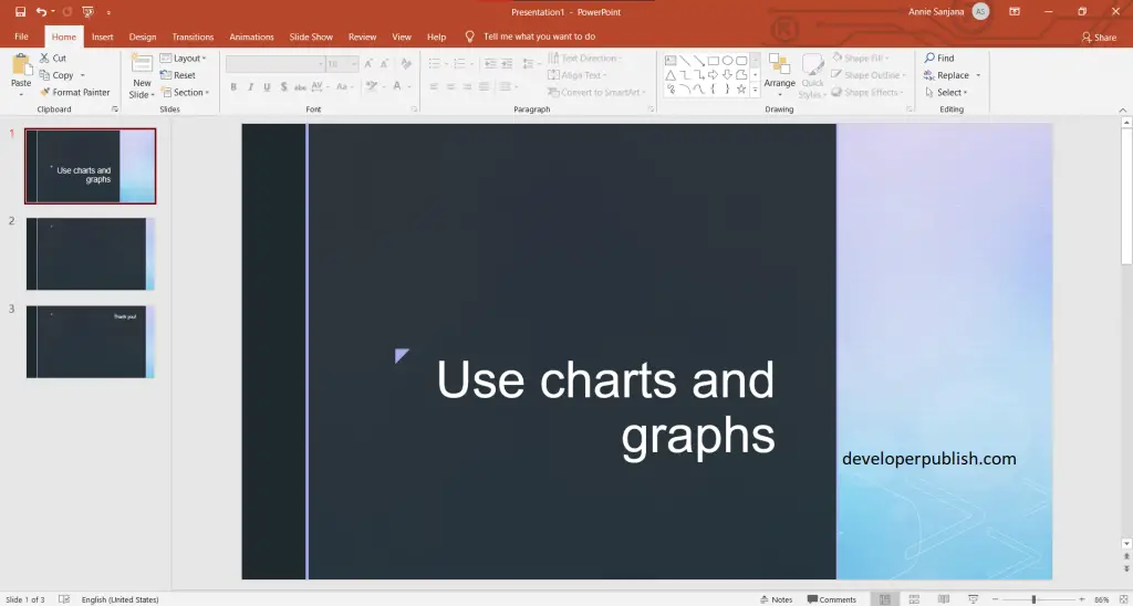
- First create a PowerPoint presentation with the required number of slides in it.
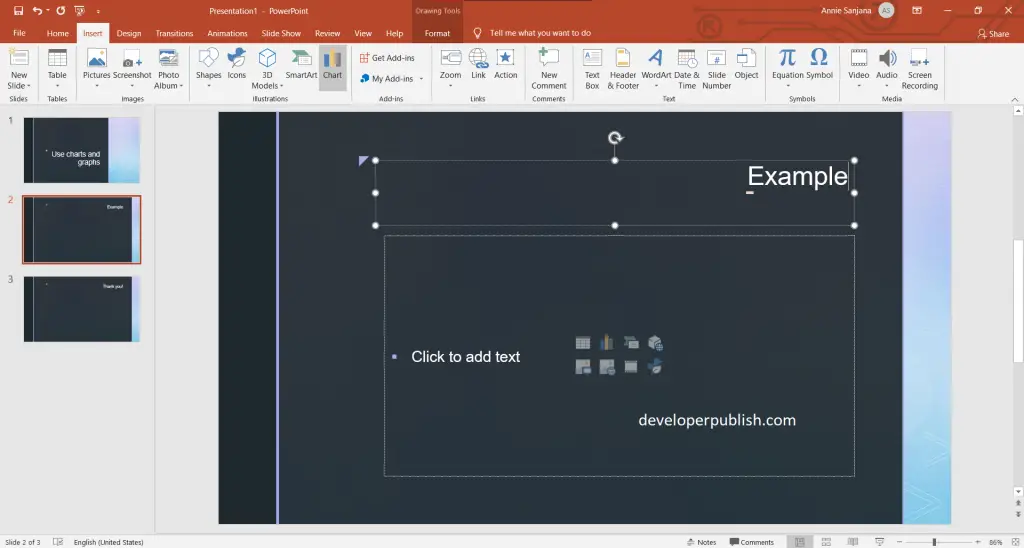
- To start with the process of using charts in PowerPoint, go to Insert tab > then click on the charts option.
- An Insert chart pane opens, where you can click the chart type and then double-click the chart you want.
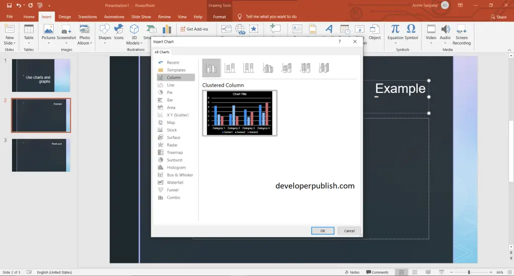
- Here you will be provided with a worksheet of random information, you can replace the information with yours.
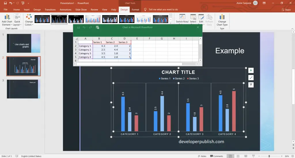
- When you have finished replacing the information, close the worksheet.
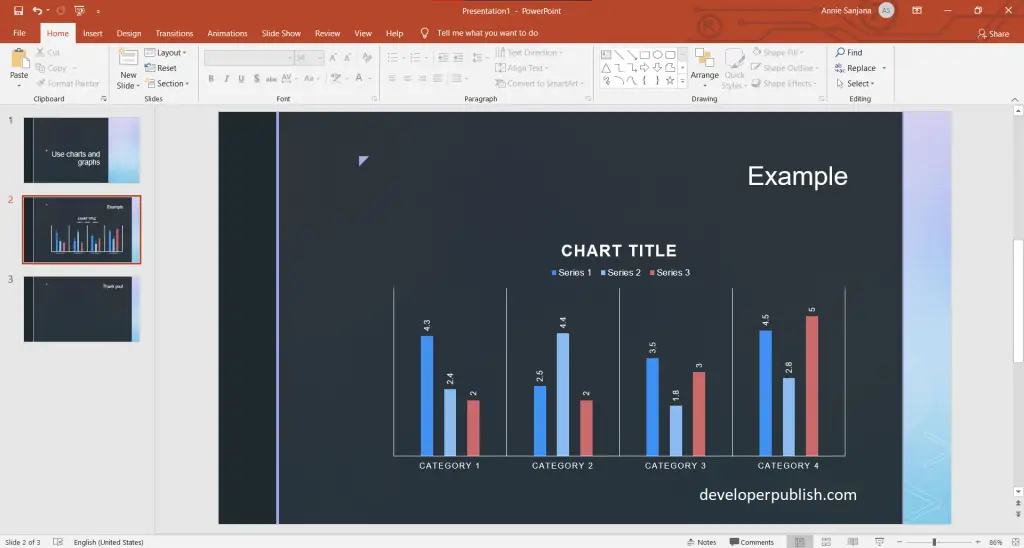
- Now you can see the result.
Hope that this article was useful and understandable.