In this post, you will get to know about the Thermometer Chart in Microsoft Excel. Also, you will learn to create a Thermometer Chart in the Excel worksheet.
What is Thermometer Chart?
A thermometer Chart in Microsoft Excel is to track a particular task. Also, it displays the current status of that task. It helps to achieve the target of that task. A thermometer chart is also called a Temperature chart.
How to Create a Thermometer Chart in Excel?
- To get started, select the data series to add the thermometer chart.
- Go to the Insert Tab, click the Column Chart icon and select the 2-D Column Chart.
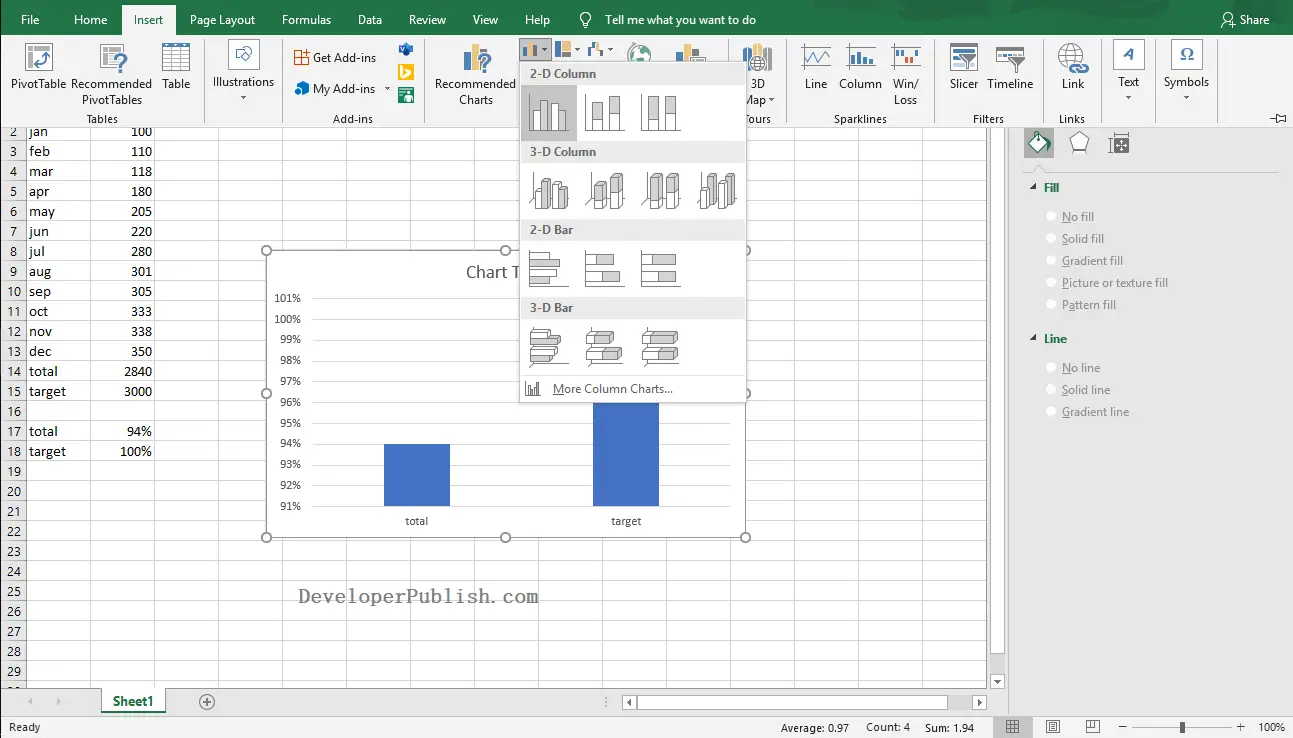
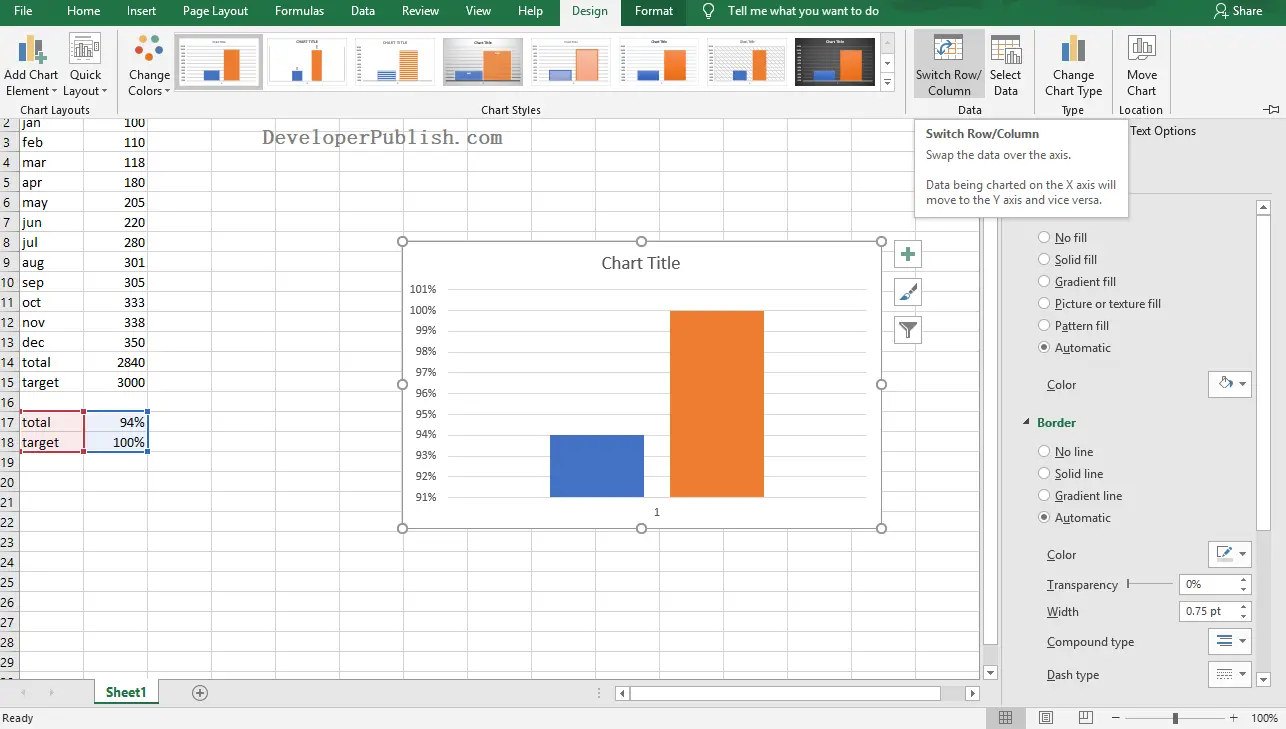
- Now, go to Design Tab and select the Switch Row Column option from the Data group.
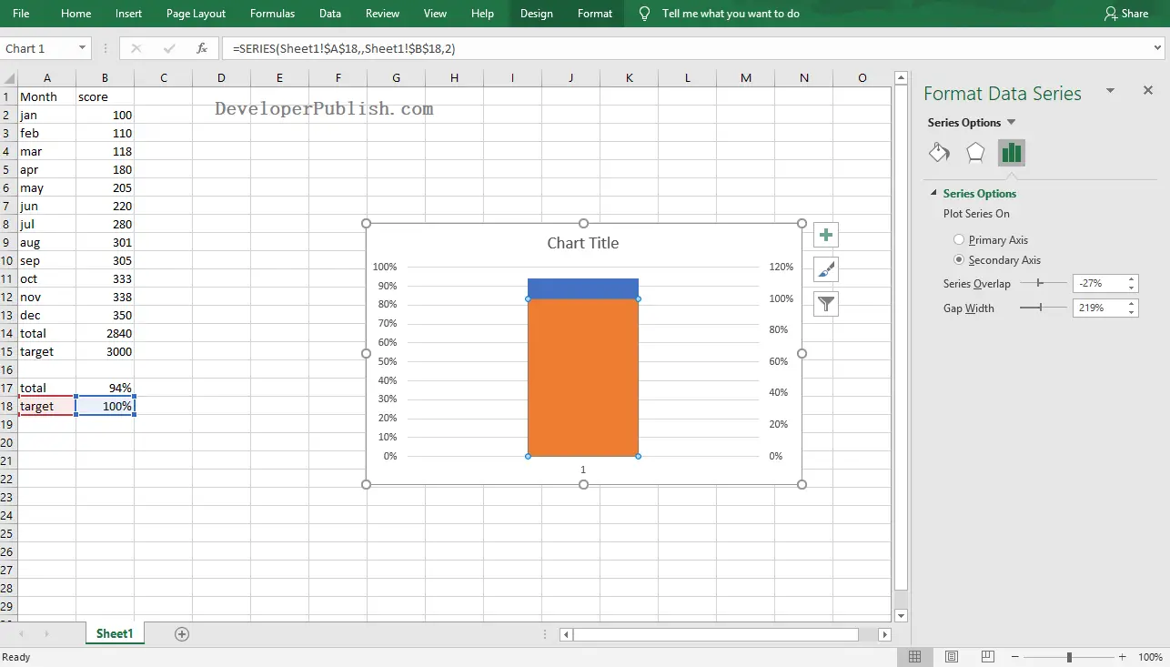
- Now, right-click on the Target series in the chart and select the Format Data Series option.
- Select the plot series on Secondary Axis as in the below image.
- Now, select the Vertical (Value) Axis in the chart and right-click on it.
- Select the Format Axis option and switch the Maximum Bound to 1 and Minimum Bound to 0 as in the below image.

Remove the Secondary Vertical (Value)Axis by clicking on it and pressing the delete key. Also, remove the Chart Title by clicking on it and pressing the delete key.
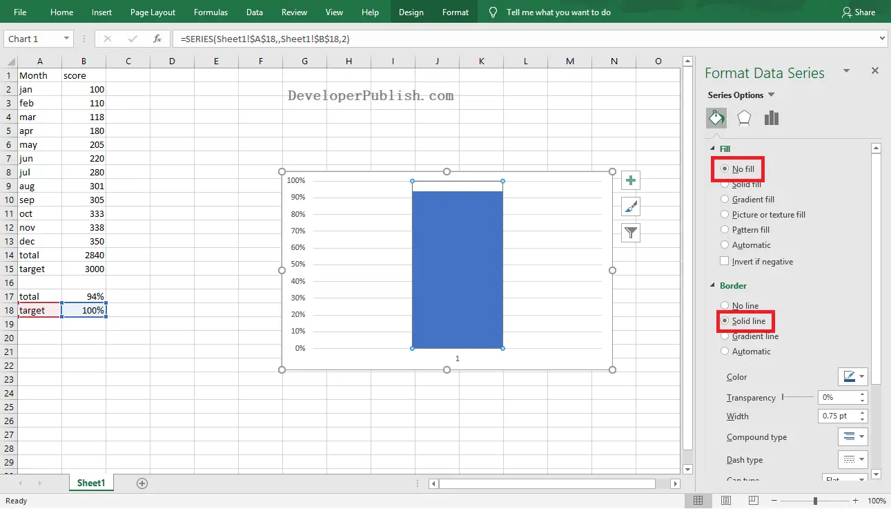
- Click the visible column on the chart and select the Format Data Series option.
- Go to the Fill & Line tab in the navigation pane, then select the No Fill option from Fill and the Solid Line option from Border.
- Now, right-click on the Vertical Axis and select the Format Data Series option.
- On the navigation pane, select the Major Type as Inside in the Tick Marks segment.

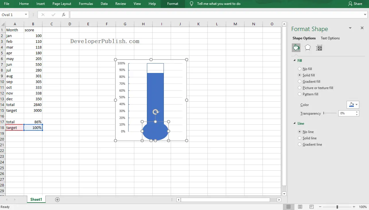
- To make it more interesting pick an oval shape from the Shapes menu in the Insert Tab.
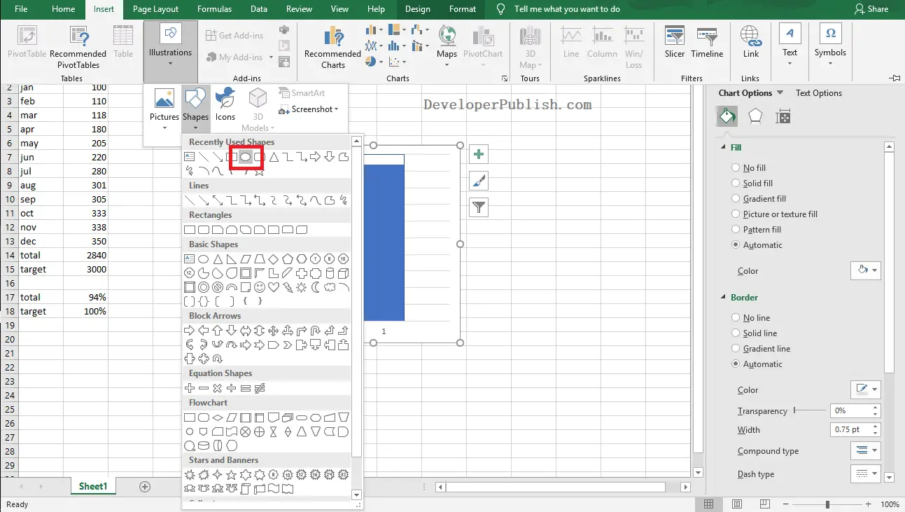
- Insert an oval shape under the column so that it appears like a thermometer. Select the No Line option from the Format Shape pane.
The below image shows the final look of the created Thermometer Chart.