In this article, you’ll learn what is a Gauge Chart in Microsoft Excel. Also, you will learn how to add a Gauge Chart to the Excel Worksheet.
What is Gauge Chart?
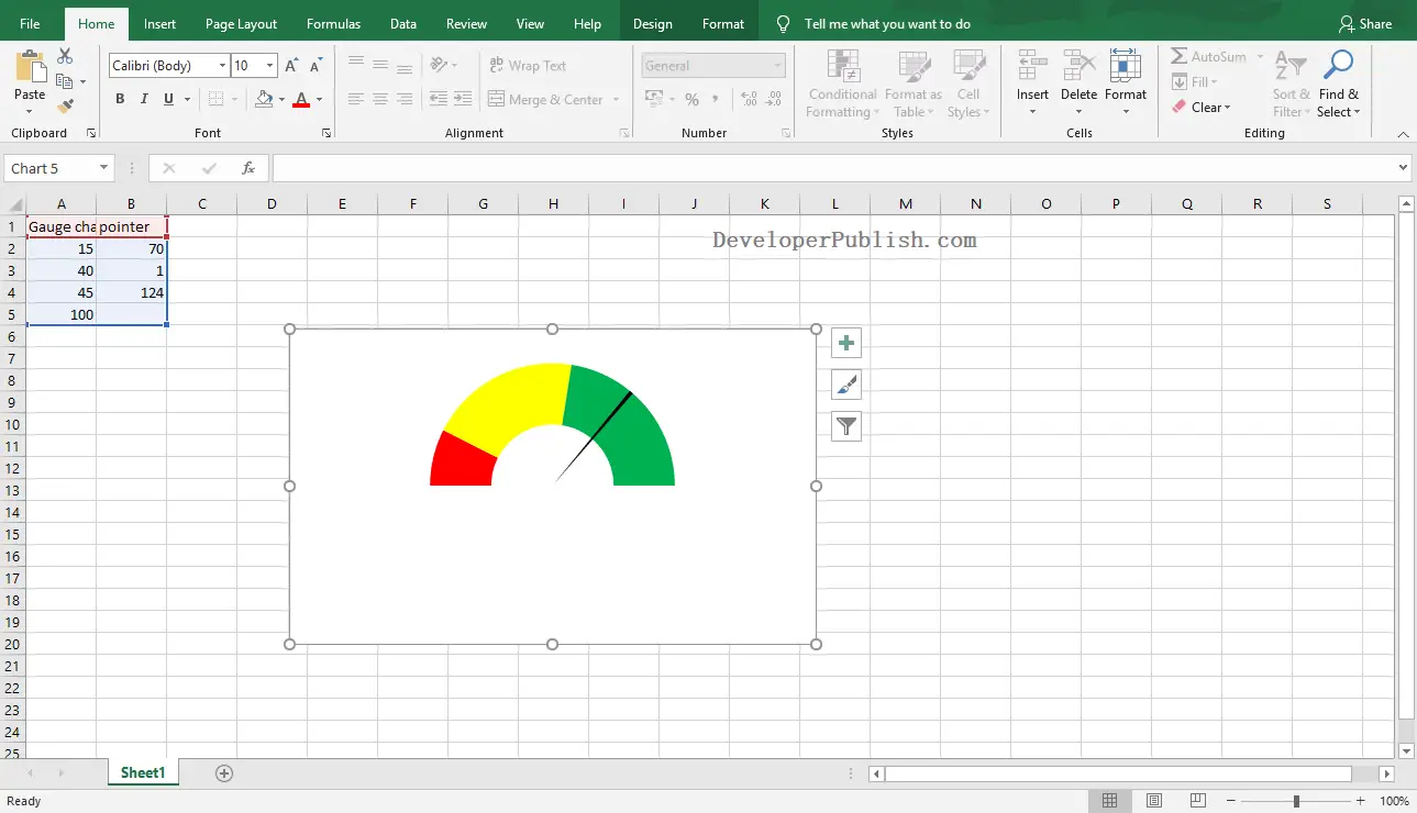
Gauge Chart is nothing but the combination of the Doughnut and Pie charts on the same chart. It is also known as Dial Chart and Speedometer Chart.
How to Add a Gauge Chart in Excel?
To get started, follow the upcoming steps below:
- Select the range of data series to insert gauge chart.
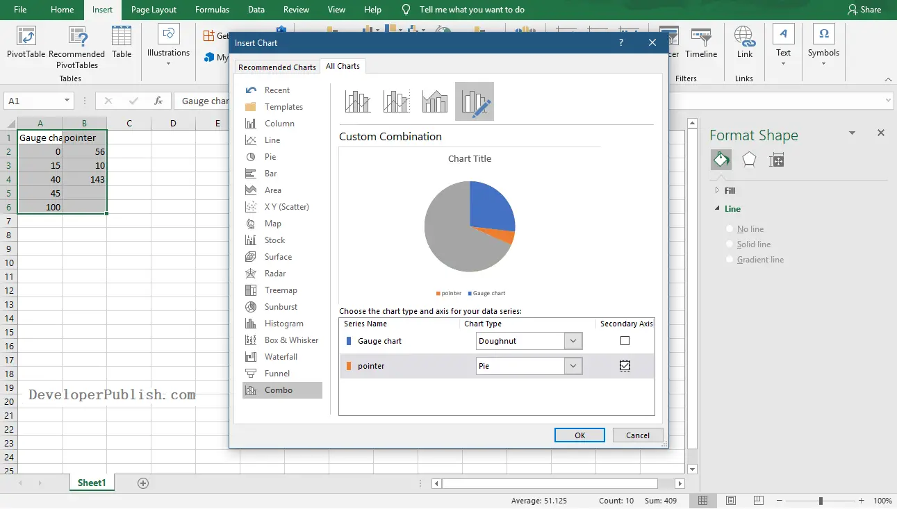
- Go to Insert Tab and click the Combo Chart icon from the Charts group.
- Select the Custom Combo Chart option.
- Select the first series as Doughnut Chart type and the second series as Pie Chart type. Also, select the pie series as the secondary axis.
- Click the Ok button.
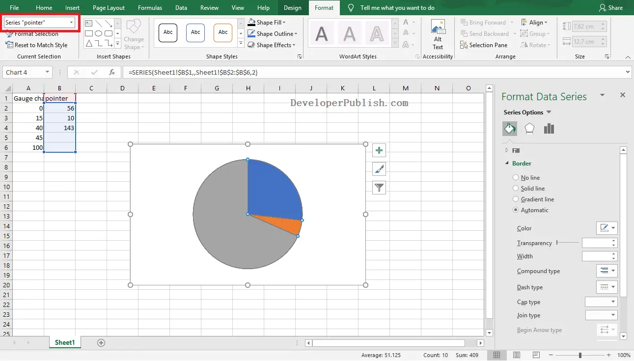
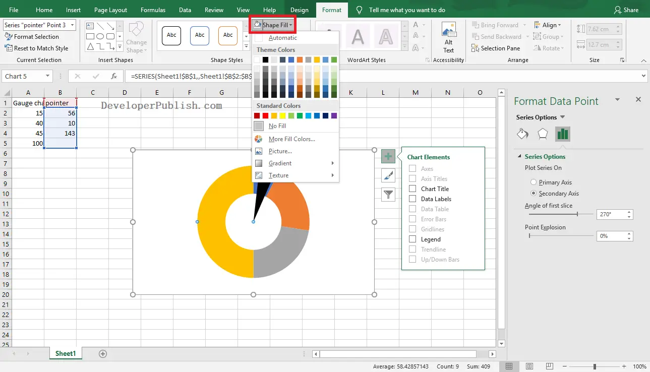
- Select the chart and go to Format Tab. Then, select the pie series of the chart from the Current Selection group.
- In the Shape styles group, select the first point of the series as No Fill, the second point as Black, and the third point of the series as No Fill.
Use the Ctrl button and the Arrow keys to select each point on the selected data series.
- Select the Doughnut series from the Current Selection group in the Format tab.
- In the Shape styles group, select the first point of the series as Red, the second point as Yellow, the third point of the series as Green, and the fourth point as No Fill.
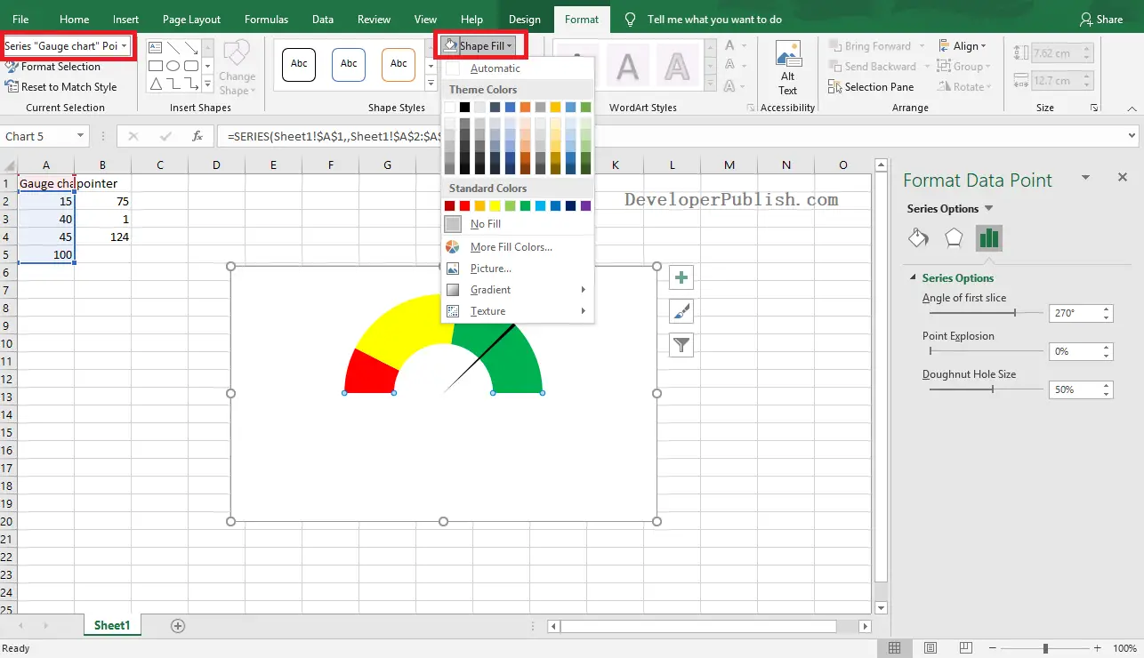
Now, you can see the created Gauge Chart in your worksheet as in the below image.