This post will explain about Pareto Chart in Microsoft Excel. Also, you will get to learn how to create a Pareto Chart.
A Pareto Chart in Excel is used to find the most frequent defects or any other factors that you can count and categorize. It helps in observing the greatest overall improvement. A Pareto chart is also called a sorted histogram chart.
How to Create Pareto Chart in Excel?
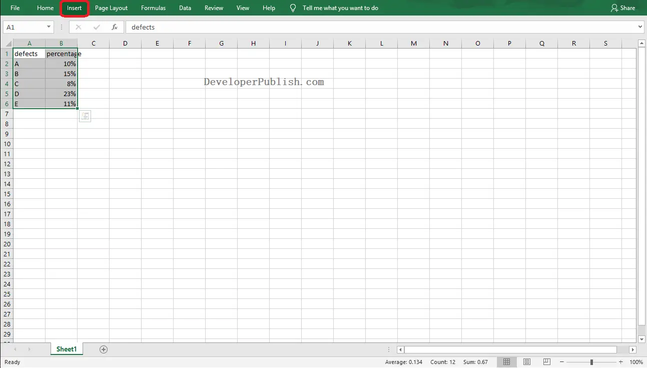
- To get started, select the data range to create a pareto chart.
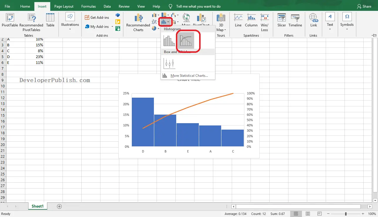
- Go to the Insert Tab, click on the Insert Statistic Chart icon from the Charts group. Select the Pareto chart type from the histogram category.
- Use the + button at the handles to add and remove the elements for the chart.
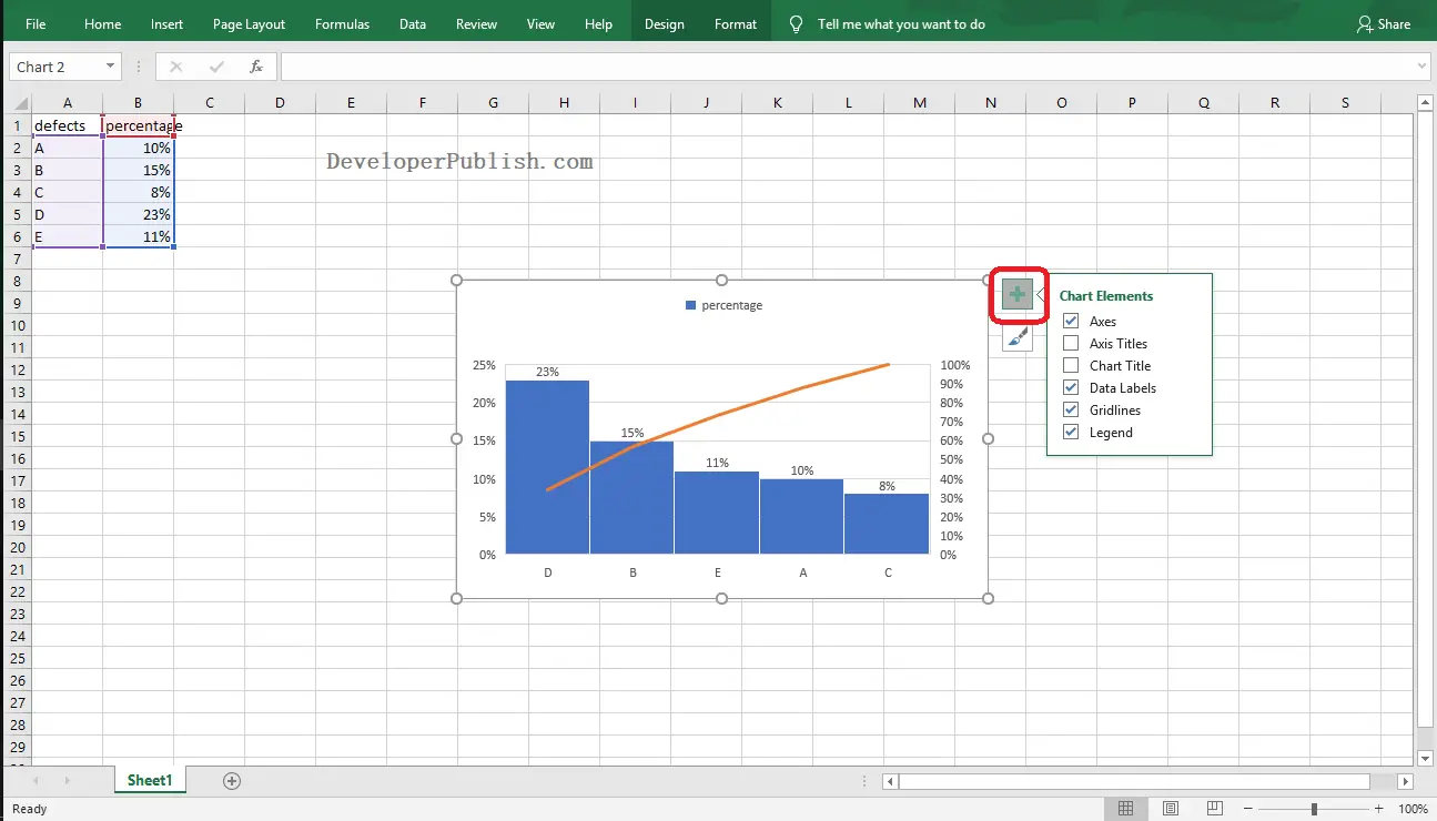
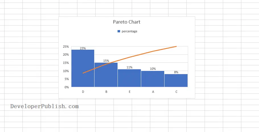
Finally the pareto chart in Excel worksheet is created as in the below image.