In this post, you’ll learn about the Combo chart in Microsoft Excel. Also, you will get to learn how to customize the combo chart in Excel.
Combo Chart in Excel
The Combo Chart in Excel will help you to combine two or more charts. Because of this feature, you can analyze the relation and differentiation of multiple Charts in Excel.
How to Add Custom Combo Chart in Excel?
To add the Combo chart in Excel, follow the below-mentioned steps:
- Select the range of the data series.
- Go to the Insert Tab in the ribbon.
- Select the Insert Combo Chart option from the Charts group.

- Select the Create Custom Combo Chart option.
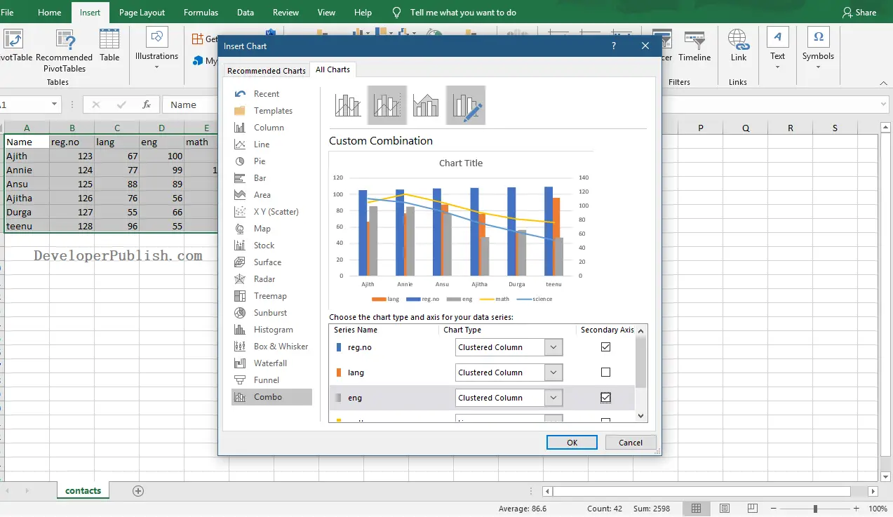
- Now, select the required data series and chart type that need to be combined.
- Then, click on the Ok button.

In the above image, you can see the created combo chart in Excel Worksheet.