In this article, you’ll get to know about the Pie Chart in Excel and how to create Pie Chart in your worksheet.
Pie Chart and Its Uses
The Pie chart type is one of the chart types in Microsoft Excel. When your total number of data is 100%, use this Pie chart to show the proportions of the whole. Each slice of pie denotes the size or percentage of that whole pie. The pie chart helps in knowing the contribution of each number in percentage or proportions.
How to Create Pie Chart in Excel?
To create a Pie Chart in Excel, follow the below-mentioned steps:
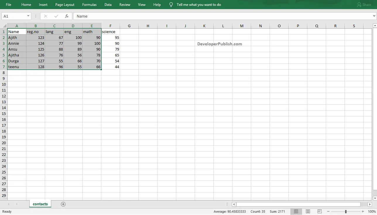
- To get started, select the range of data that you want to include in your chart.
- Go to the Insert Tab, click on the Insert Pie Chart button in the Charts group.

- Click the down arrow to get different types of pie charts. Move the cursor through the icons and pause to have a preview of each type.
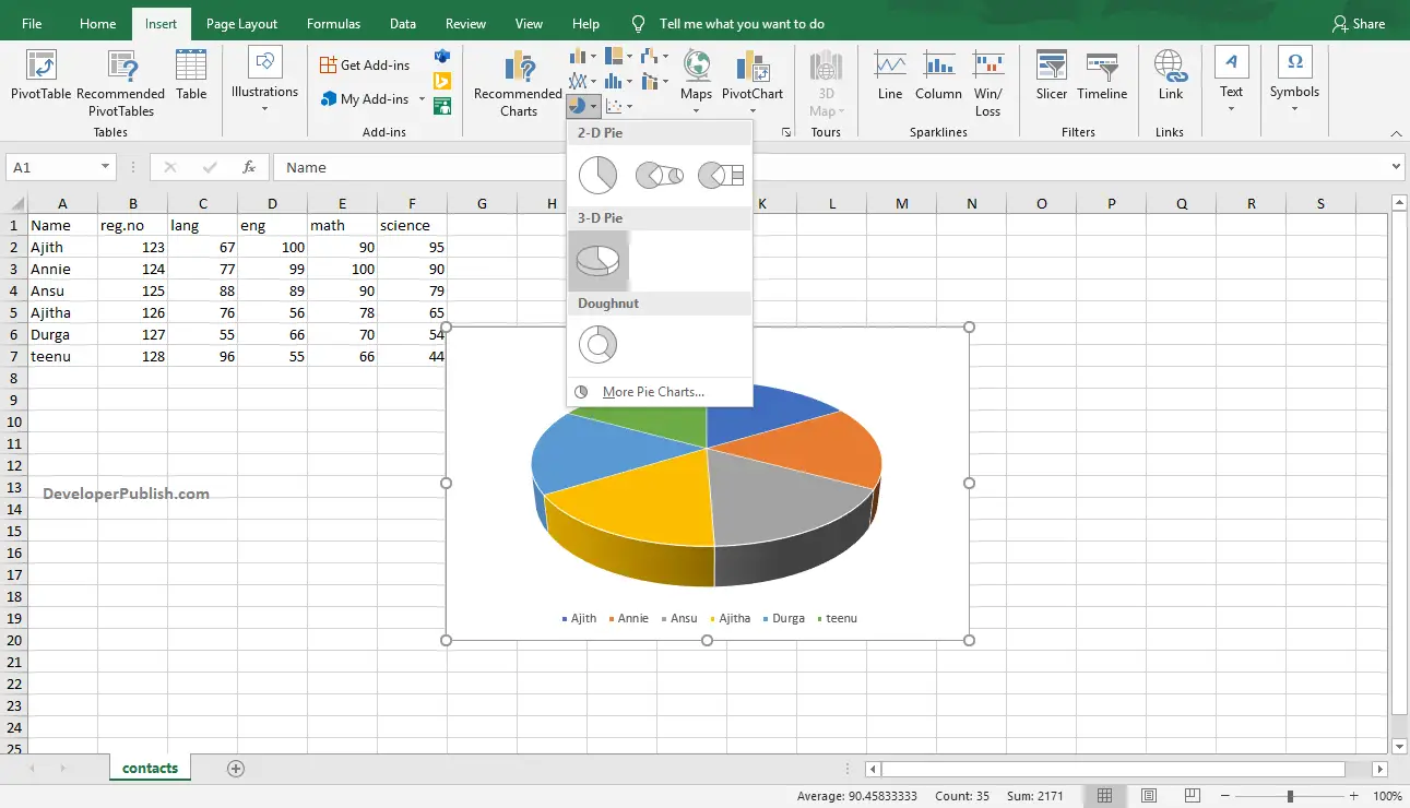
- Select your desired type of line chart by clicking on it.

- To change the style of the chart created, click on the chart and go to Design Tab.
- Select the desired pie chart style from the Chart Styles group by clicking on it.
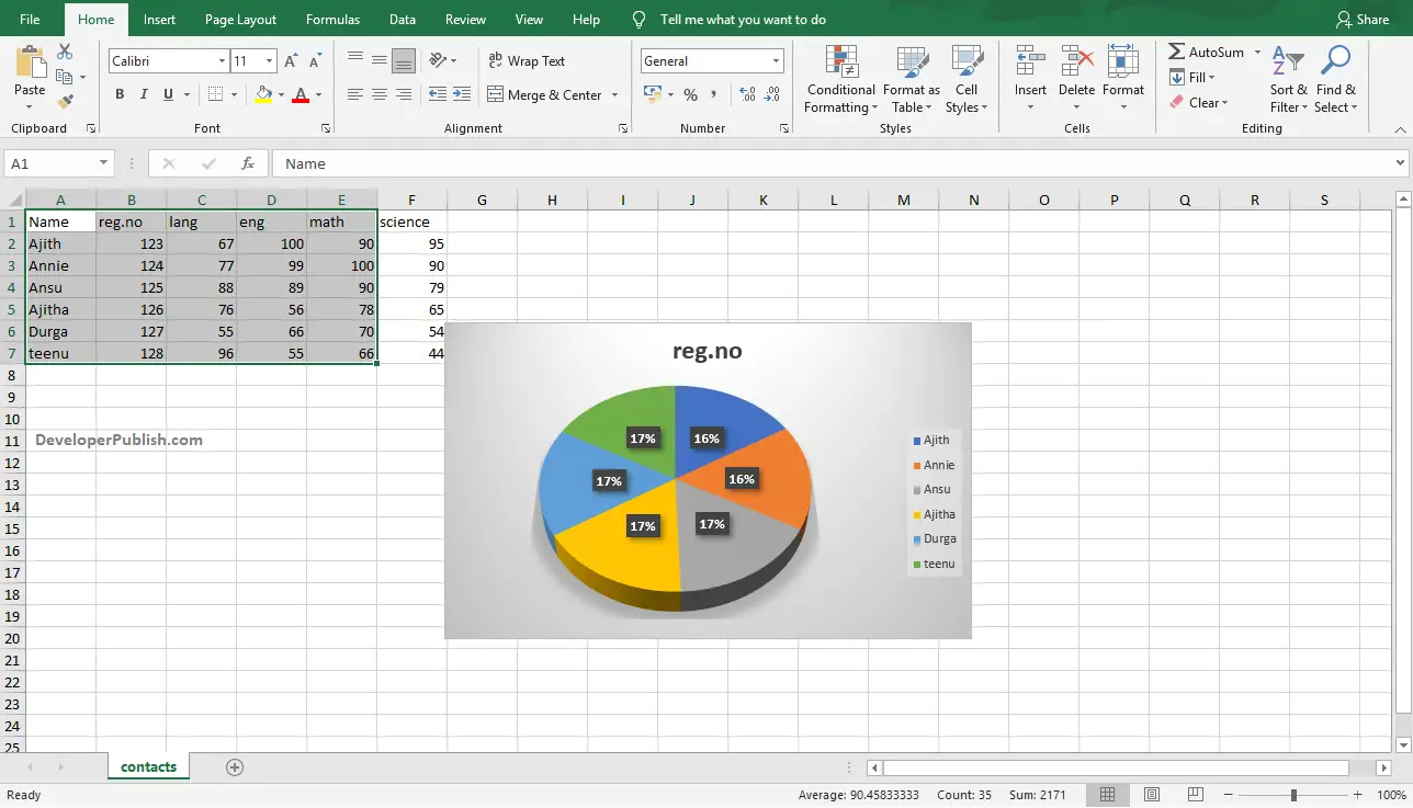
- The above image shows the created Pie chart on the worksheet in Microsoft Excel.