In this article, you will get to know about the column chart and its uses also how to create column chart in Excel.
Column Chart and Its Uses
The Column Chart is one of the primary charts in Microsoft Excel. It displays the data values with vertical columns and categories along horizontal.
It provides the comparisons of the set of values, also helps to know the developments between two or more data values. It is an excellent way to show change over time.
How to Create a Column Chart in Excel?
To create a column chart in Excel, follow the below-mentioned steps:
- To get started, select the range of data that you want to include in your chart.

- Go to the Insert Tab, click on the Insert Column button in the Charts group.
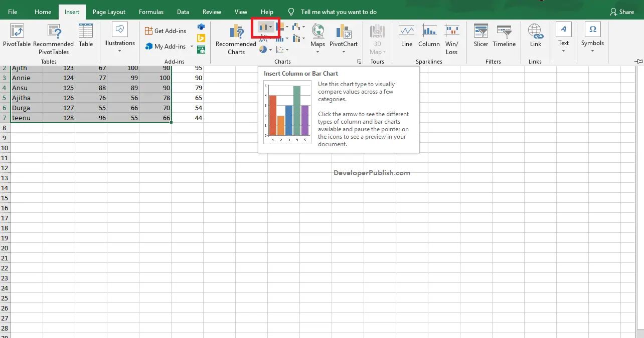
- Click the down arrow to get different types of a column chart.
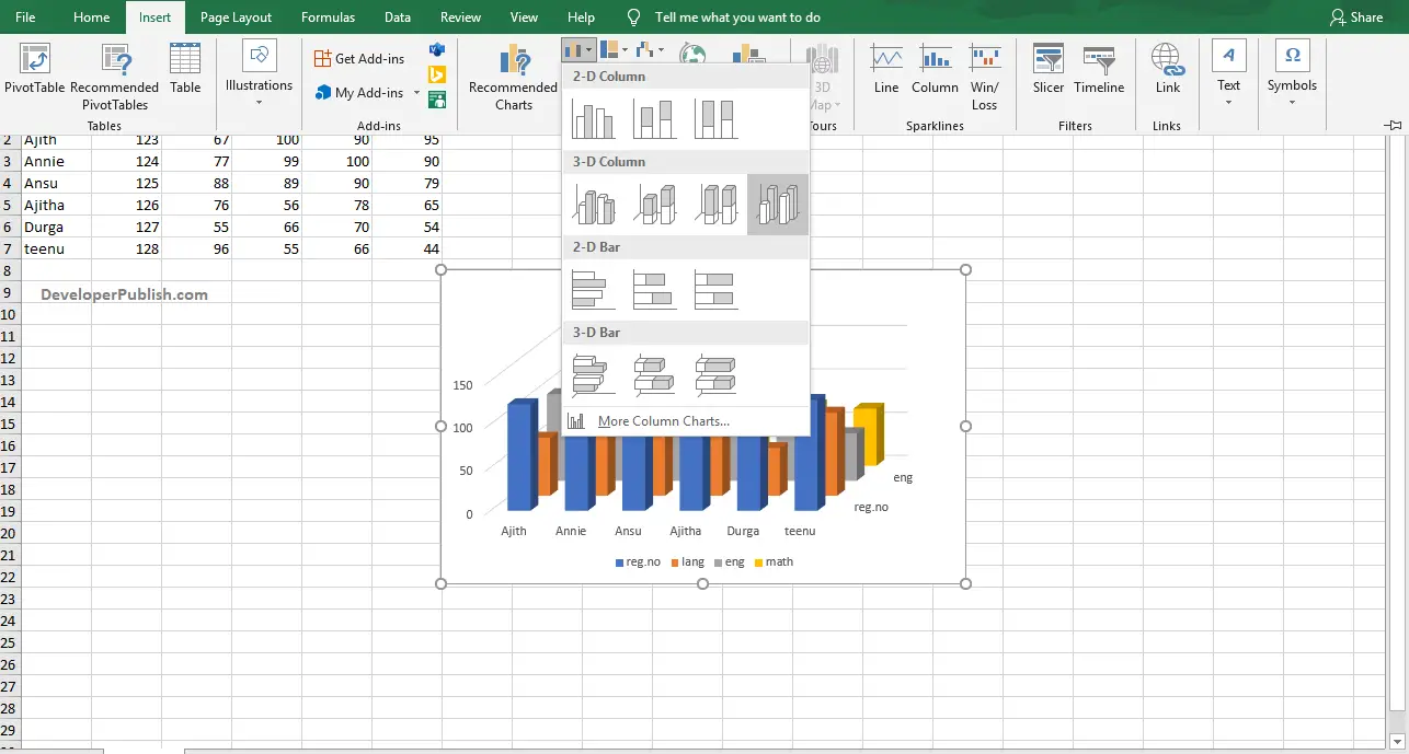
- Move the cursor through the icons and pause to get the preview of that type. Select the desired type of column chart by clicking on it.
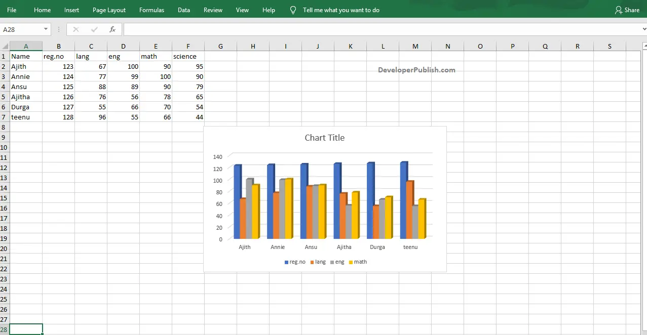
- In the above image, you can see the created 3D Clustered Column Chart.