In this article, you’ll learn what is scatter plot in Microsoft Excel and how to create a scatter plot in an Excel worksheet.
The Scatter Plot chart types show the relationship between the set of values. A scatter plot is also called a Scatter graph that uses dots to represent each different value.
How to Create a Scatter Plot in Excel?
The below-mentioned steps explains the procedure to create a scatter plot in Excel worksheet:
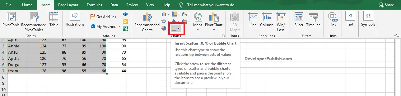
- Select the data that you want to plot in your scatter chart.
- Go to the Insert tab in the ribbon and click on the Insert Scatter or bubble chart icon in the Charts group.
- Click the down arrow in the Insert Scatter option to get different types of scatter chart types. Pause the cursor on the icon of each chart type to get a preview in your document.
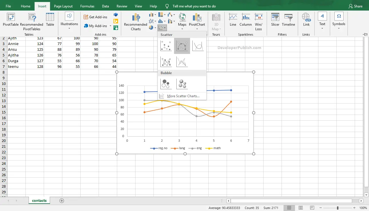
- Click on your desired scatter chart type by clicking on it.
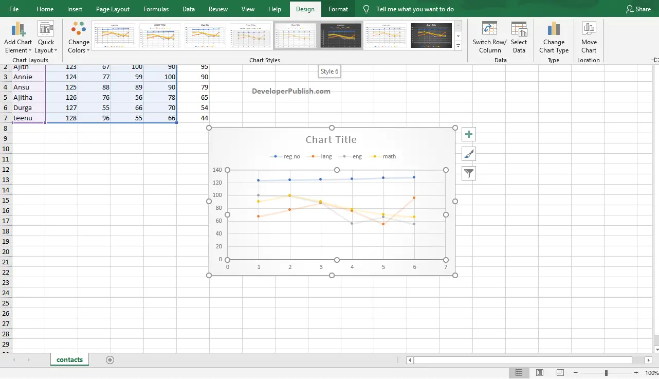
- To change the style of the chart, go to the Design tab and select a style from the Chart Styles group by clicking on it.
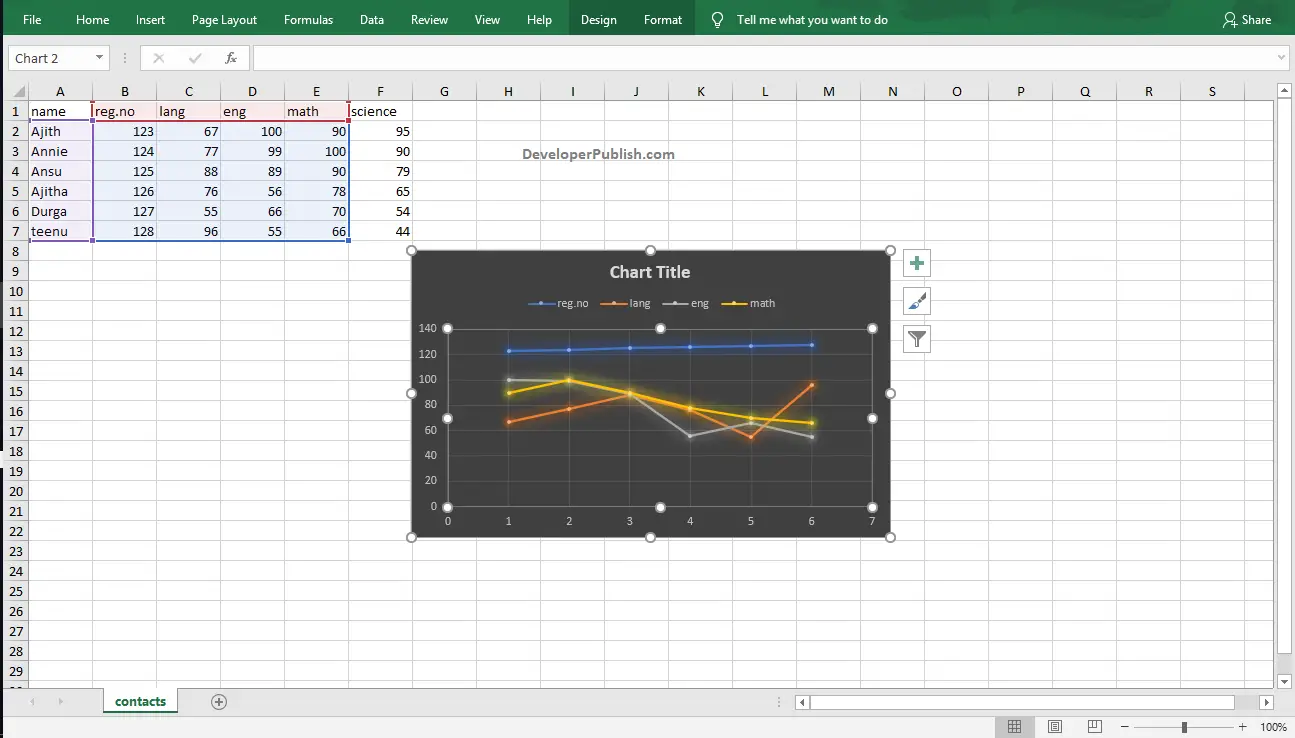
- In the above image, you can see the created Scatter Plots in the Excel worksheet.
If the Design Tab is not visible in your document, click on the chart, you will get the Design Tab from Chart Tools in the ribbon.