Google Maps & Colors – A Detailed Tutorial
Google Maps is one of the most popular navigation apps, used by millions of people worldwide to find their way around. One of the features that make Google Maps so useful is its color-coded system, which allows users to easily understand different types of locations and their significance. In this post, we’ll discuss the different colors used in Google Maps and their meanings, along with examples.

- Blue
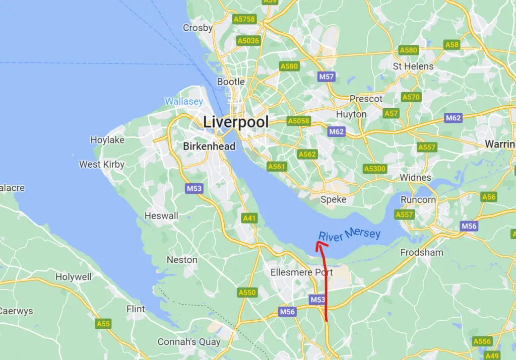
The color blue is commonly used to indicate water bodies, such as rivers, lakes, and oceans. In Google Maps, blue represents bodies of water, and the color intensity is used to indicate the depth of the water. For example, a deeper blue color represents a deeper body of water, while a lighter blue color represents a shallow body of water.

Example: The Amazon River in South America is marked in blue in Google Maps. The color intensity changes as the river flows from its origin in the Andes to its mouth in the Atlantic Ocean.
- Green
The color green is associated with nature and vegetation. In Google Maps, green is used to represent parks, forests, and other areas with natural vegetation. The color intensity is used to indicate the density of vegetation. A darker shade of green represents a denser forest or park, while a lighter shade of green represents an area with sparse vegetation.
Example: The Central Park in New York City is marked in green in Google Maps. The color intensity changes as you move from the densely forested areas to the open spaces and lawns.
- Red
The color red is commonly used to indicate danger, warning, or important information. In Google Maps, red is used to represent important landmarks, such as government buildings, museums, and hospitals. The color intensity is used to indicate the level of importance, with a darker shade of red representing a more important landmark.
Example: The White House in Washington DC is marked in red in Google Maps. The intensity of the color is darker than other nearby buildings, indicating its significance as an important landmark.
- Yellow
The color yellow is commonly used to indicate caution or warning. In Google Maps, yellow is used to represent areas with heavy traffic, such as highways and main roads. The color intensity is used to indicate the level of traffic congestion, with a darker shade of yellow representing a heavier traffic flow.
Example: The New Jersey Turnpike is marked in yellow in Google Maps, indicating heavy traffic flow on this major highway.
- Orange
The color orange is commonly used to indicate a moderate level of warning or caution. In Google Maps, orange is used to represent areas with moderate traffic, such as secondary roads and streets. The color intensity is used to indicate the level of traffic flow, with a darker shade of orange representing a higher traffic flow.
Example: The streets of Manhattan in New York City are marked in orange in Google Maps, indicating a moderate traffic flow.
- Gray
The color gray is commonly used to indicate areas with limited or no activity. In Google Maps, gray is used to represent areas with no development, such as deserts and mountains. It’s also used to represent areas that are under construction or undergoing renovation.
Example: The Sahara Desert in North Africa is marked in gray in Google Maps, indicating an area with no development.
- Purple
The color purple is associated with royalty and luxury. In Google Maps, purple is used to represent areas with luxury hotels, resorts, and casinos. The color intensity is used to indicate the level of luxury, with a darker shade of purple representing a higher level of luxury.
Example: The Bellagio Hotel and Casino in Las Vegas is marked in purple in Google Maps, indicating a luxurious hotel and casino.
- Brown
The color brown is associated with natural earth tones, such as soil and sand. In Google Maps, brown is used to
represent areas with natural features, such as mountains, hills, and deserts. The color intensity is used to indicate the elevation, with a darker shade of brown representing a higher elevation.
Example: The Rocky Mountains in the western United States are marked in brown in Google Maps, indicating a mountainous region with varying elevations.
- Pink
The color pink is associated with femininity, love, and romance. In Google Maps, pink is used to represent areas with shopping centers, boutiques, and other retail establishments that cater primarily to women. The color intensity is used to indicate the level of shopping activity, with a darker shade of pink representing a higher level of activity.
Example: The Rodeo Drive shopping district in Beverly Hills is marked in pink in Google Maps, indicating a high-end shopping area that caters primarily to women.
- Light Blue
The color light blue is associated with tranquility, calmness, and relaxation. In Google Maps, light blue is used to represent areas with beaches, swimming pools, and other water-based recreational facilities. The color intensity is used to indicate the level of activity, with a darker shade of blue representing a higher level of activity.
Example: The beaches of Miami, Florida, are marked in light blue in Google Maps, indicating areas with water-based recreational activities.
Google Maps uses a color-coded system to represent different types of locations and their significance. The color blue is used for water bodies, green for natural vegetation, red for important landmarks, yellow for heavy traffic areas, orange for moderate traffic areas, gray for undeveloped or under construction areas, purple for luxury establishments, brown for natural features, pink for shopping areas for women, and light blue for water-based recreational areas. By understanding the meaning of these colors, users can easily navigate and explore the world around them using Google Maps.


Leave a Review