Customize Axes in Excel
In this post, you’ll learn about axes in Microsoft Excel and how to customize axes in Excel like type, title, and scale.
All chart in Excel has its numeric values and data points. Those points are plotted on a horizontal line called X-axis and a vertical line called Y-axis.
How to Customize Axes in Excel?
The below-mentioned steps will explains how to format the Axes in Excel worksheet:
- To get started, tap on the chart in which the axes need to be customized.
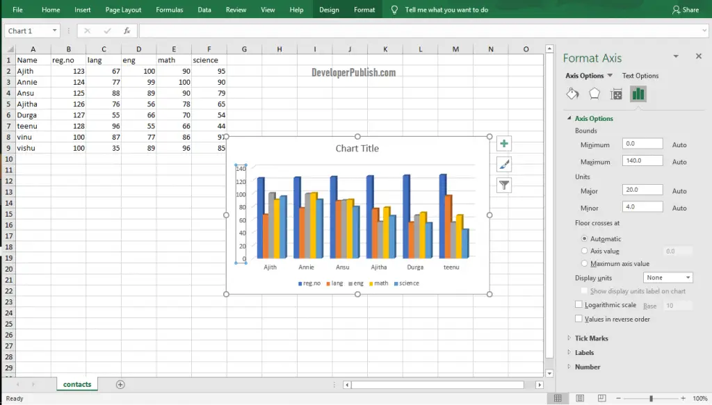
- Now, right-click on the axis in that chart to get the Format Axis navigation pane.
- You can customize the axes according to your requirements using the options in Format axis pane.
- Close the Pane after customizing.
Changing Axes Type In Excel
- Select the axis and open the Format Axis navigation pane.
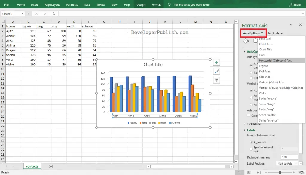
- Click the arrow in the Axis Option and select the desired type.
- Close the pane after changing the axis type.
Axis Title
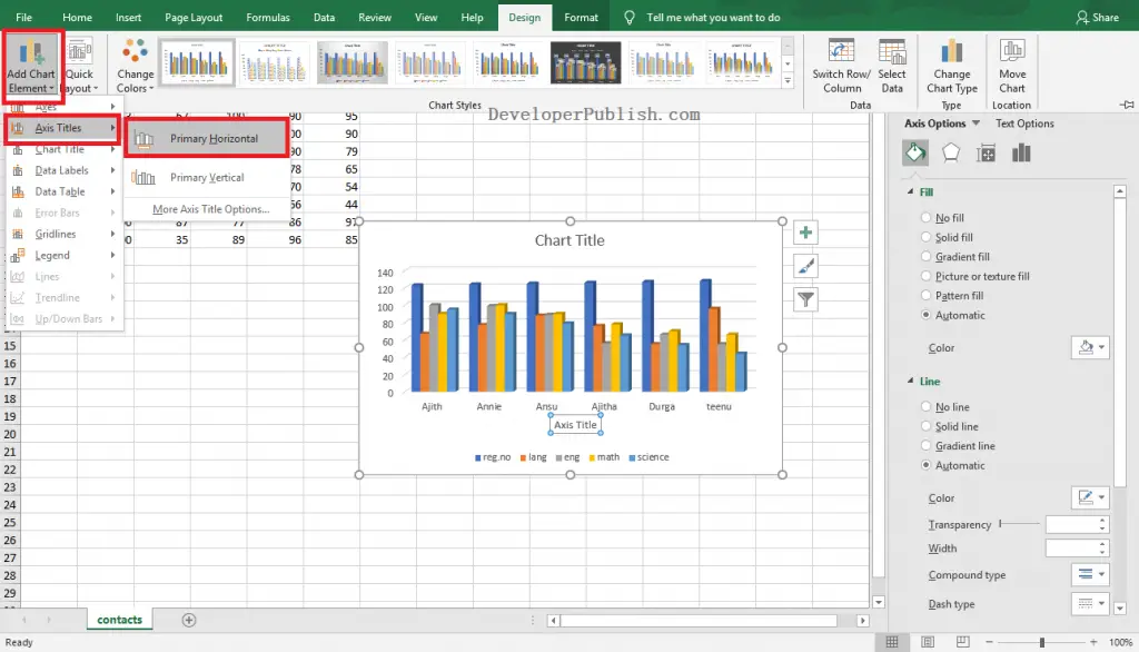
- Click anywhere on the chart, go to Design Tab in the ribbon.
- Click on the Add Chart Elements option in the Chart Layouts group.
- Select the Axis Title option from the pop-down menu.
- Now, select the axis to which you want to add the title.
- Enter the Axis title in the text box visible on your chart.
If you want to remove the axis title created, Right-Click on the axis title that needs to be removed and select the Delete option from the pop-down menu.
Axis Scale
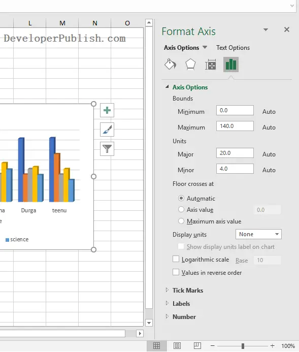
- Open the Format Axis pane and select the Vertical Axis or Horizontal Axis option from the Axis Options menu.
- Select the desired options and values to change the scale of the Axis.




Leave a Review