In this article, you’ll get to know about the Line Chart in Excel and how to create a Line Chart in your worksheet in Microsoft Excel.
Line Chart in Excel
The Line Chart is also a primary chart type in Microsoft Excel. The Line Chart is also called Run Chart or Line Graph. In this chart type, each data series denoted with a separate line. The Line charts are commonly used to track changes over the period between two or more data series.
How to Create a Line Chart?
To create a line chart in Excel, follow the below-mentioned steps:
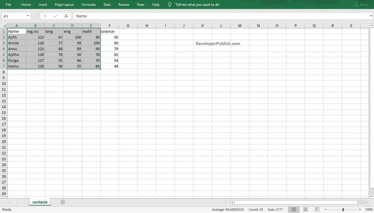
- To get started, select the range of data that you want to include in your line chart.
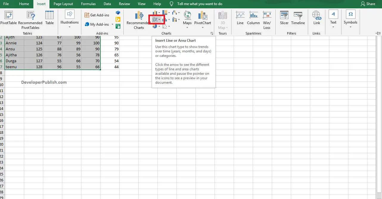
- Now, go to the Insert tab in the ribbon and click on the Insert Line Chart options from the Charts group.
- Click the down arrow to get different types of line charts. Move the cursor through the icons and pause to have a preview of each type.
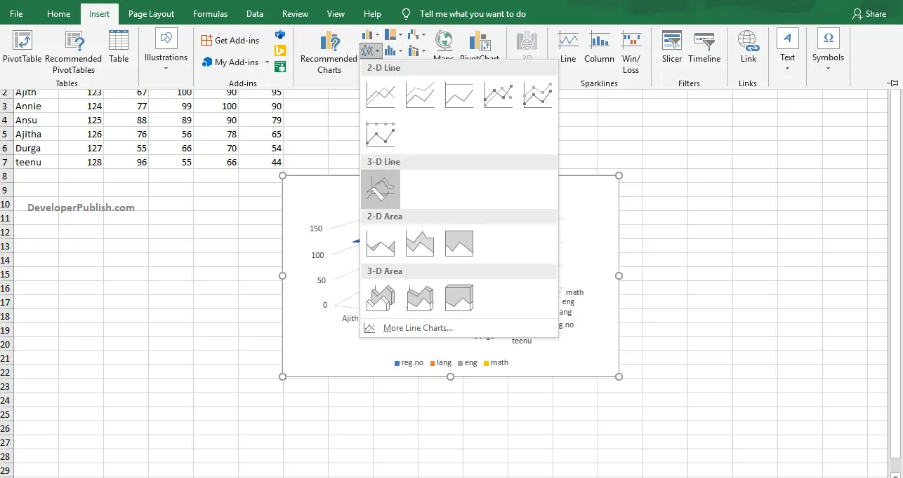
- Select your desired type of line chart by clicking on it.
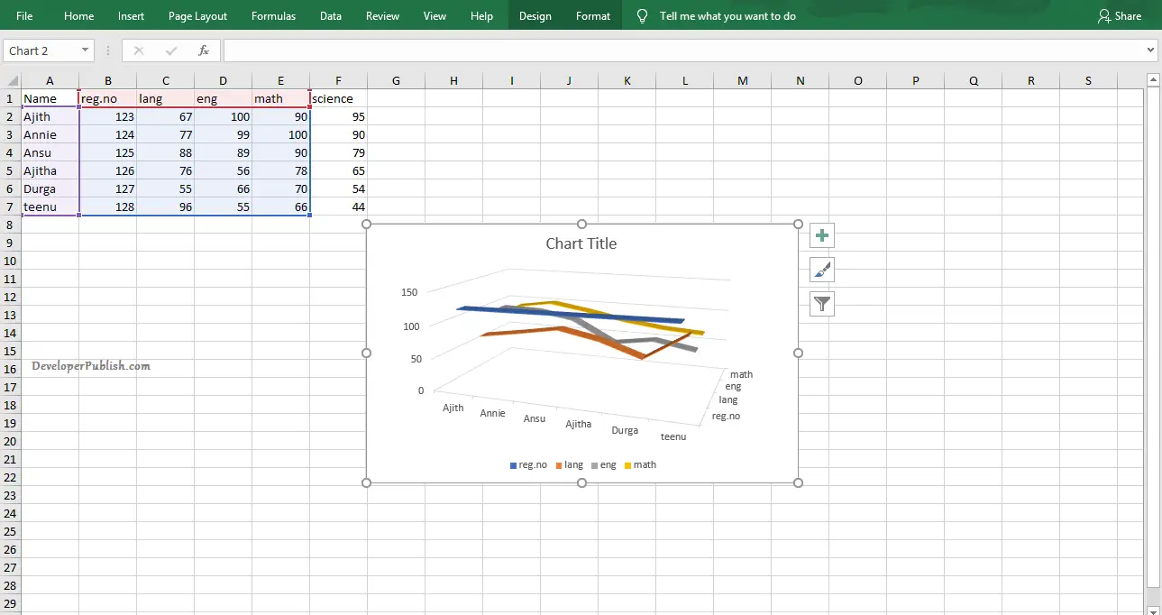
The above image shows the created Line chart on the worksheet in Microsoft Excel.