Oxygene and WP8 – Templates in XAML
There are 2 different types of templates which the developers can use to customize the controls . These include.
- ControlTemplate
- DataTemplate
ControlTemplate
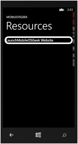
The ControlTemplate can be used to customize the look of the control without affecting its behavior.
One of the drawbacks of the Style element when compared to the ControlTemplate is that the Style can only be used to set the properties that are available in the TargetType Control.
With the ControlTemplate , one can access the complete primitive parts that make up a control.
Below is a sample code snippet that demonstrates how to use the ControlTemplate to display rounded corner for the button.
<Button x:Name="btnLaunch" >
  <Button.Template>
    <ControlTemplate>
      <Border CornerRadius="20"
        BorderThickness="10"
        BorderBrush="White">
        <TextBlock>
          LaunchMobileOSGeek Website
        </TextBlock>
      </Border>
    </ControlTemplate>
  </Button.Template>
</Button>
DataTemplate
The DataTemplate is used to display the data inside the control or its area. The content displayed depends on the data that is bound to the template. Some of the Controls that uses the DataTemplate are ListBox , LongListSelector etc.
Below is a sample code snippet demonstrating the usage of the DataTemplate with the LongListSelector
<phone:LongListSelector >
  <phone:LongListSelector.ItemTemplate>
    <DataTemplate>
      <TextBlock Text="{Binding Name}">
      </TextBlock>
    </DataTemplate>
  </phone:LongListSelector.ItemTemplate>
</phone:LongListSelector>


Leave a Review