Azure Charts – All about Azure news, stats, and Changes
In this post, you’ll learn about the website Azure Charts which provides you with information about all the features and announcements related to the Azure products.
What is Azure Charts?
Alexey Polkovnikov, a Microsoft employee, has designed the Azure Chart as a side project. The Azure Chart website collects together all Azure news, analytics, and changes using public updates, RSS channels, and web pages as data sources and displays them in a nice Visualization format.
The Azure Heat Map is a fantastic visual representation of the most recent Azure product developments. The webpage lists all Azure services and emphasizes those that have received an upgrade in bright color while darkening those that have not. Then, by clicking on the tile for that product, you’ll be sent to a news story on the official Microsoft website where you can learn more about the update.

Some of the Other features on the website include
- Azure Timeline which provides the Timeline of Azure services arrivals by published timeframes for specific regions.
- Azure Region Scope provides the Service presence/status by region, including accessible non-regional services. Rebuilt daily.
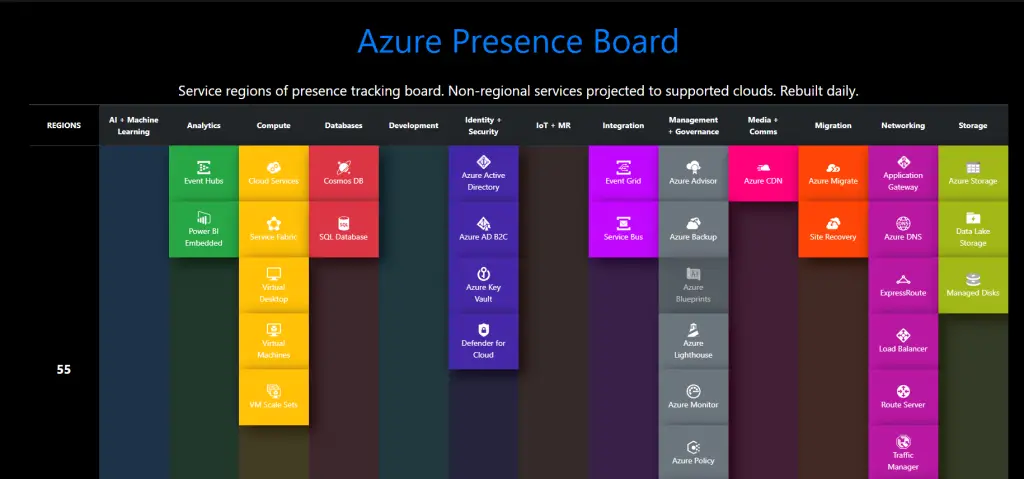
- Azure Presence Board that provides the Service regions of presence tracking board. Non-regional services are projected to support clouds.
Additionally, the website also offers some Azure Menu, and Azure Quiz that keeps you updated about Azure.
Overall, the Azure Charts website is a great resource for someone who wants to keep updated about what’s happening in Azure.
You can access Azure Charts by visiting its official website.


Leave a Review