Alignment Grid Overlay for Windows Phone Projects in Visual Studio 2012
When you create a new Windows Phone Project in Visual Studio 2012 , you can observe that in the end of the MainPage.XAML , there is a comment which states the following
<!–Uncomment to see an alignment grid to help ensure your controls are
aligned on common boundaries. The image has a top margin of -32px to
account for the System Tray. Set this to 0 (or remove the margin altogether)
if the System Tray is hidden.
Before shipping remove this XAML and the image itself.–>
<!–<Image Source=”/Assets/AlignmentGrid.png” VerticalAlignment=”Top” Height=”800″ Width=”480″ Margin=”0,-32,0,0″ Grid.Row=”0″ Grid.RowSpan=”2″ IsHitTestVisible=”False” />–>

Note that there is also an image “AlignmentGrid.png” that exists in the Assets folder of the Windows Phone Project.
Alignment Grid Overlay for Windows Phone Projects in Visual Studio 2012
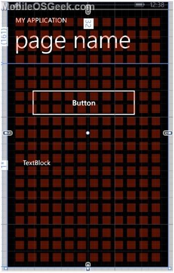
By uncommenting the code that has the element “Image” from the above code , you will observe that it overlays the grid on top of your Windows Phone Page .

This will help you to verify the alignment of the controls both at runtime and design .


Leave a Review